No design system = Painful process
Without an established source of truth for design components, our teams faced these 3 core problems continually. From the business side, team members were not given the tools to success, slowed down, and frustrated.
1
Designs looked old and inconsistent
2
Time was being wasted rebuilding similar components
3
Accessibility was an after thought
Starting from scratch after 2 fails...
When I arrived at SMG, the Design department had only been around for 4 years. The need for a scaleable system was foreign to most of the team, so the first attempts (a single photoshop file & a developer sandbox) fell short of the need and failed to get adopted by key stakeholders.
Engineering leadership didn’t want to deal with the dependencies that come with a 3rd party library. So we couldn’t use existing libraries (like Material Design, IBM Carbon, Ionic, etc).
But we also didn’t have a Product Manager, Developers, or Designer hired / budgeted to the work of building an in-house system.
I ran the numbers and found that a Design System would save us millions of dollars a year, just in more efficient developer cycle time. So I knew it was worth it and decided to do it myself the best I could.
Looking back – This was ironic because 2 years later, new leaders forced us to trade our in-house system for a 3rd party system (which didn't work)… We went back to our own system within 10 months. That season taught me to be more vocal on design convictions, and that out of the box solutions come with problems too.
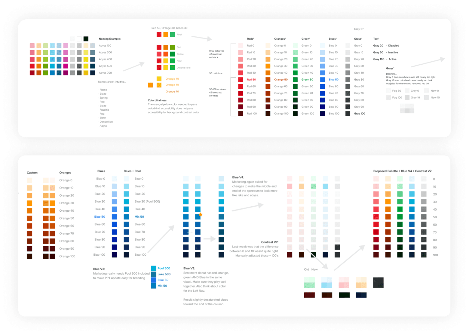
Starting with color theory in my free time (lots of reading)
When I had extra time outside my core projects, I read every Medium article I could find on colors for design systems. After a few months, I got started: with accessibility and a modern look as top priorities.
It took longer to collaborate and revise colors with others, but the result came with cross-company ownership and excitement.
• Improved brand perception, accessibility, legibility, dev work, etc
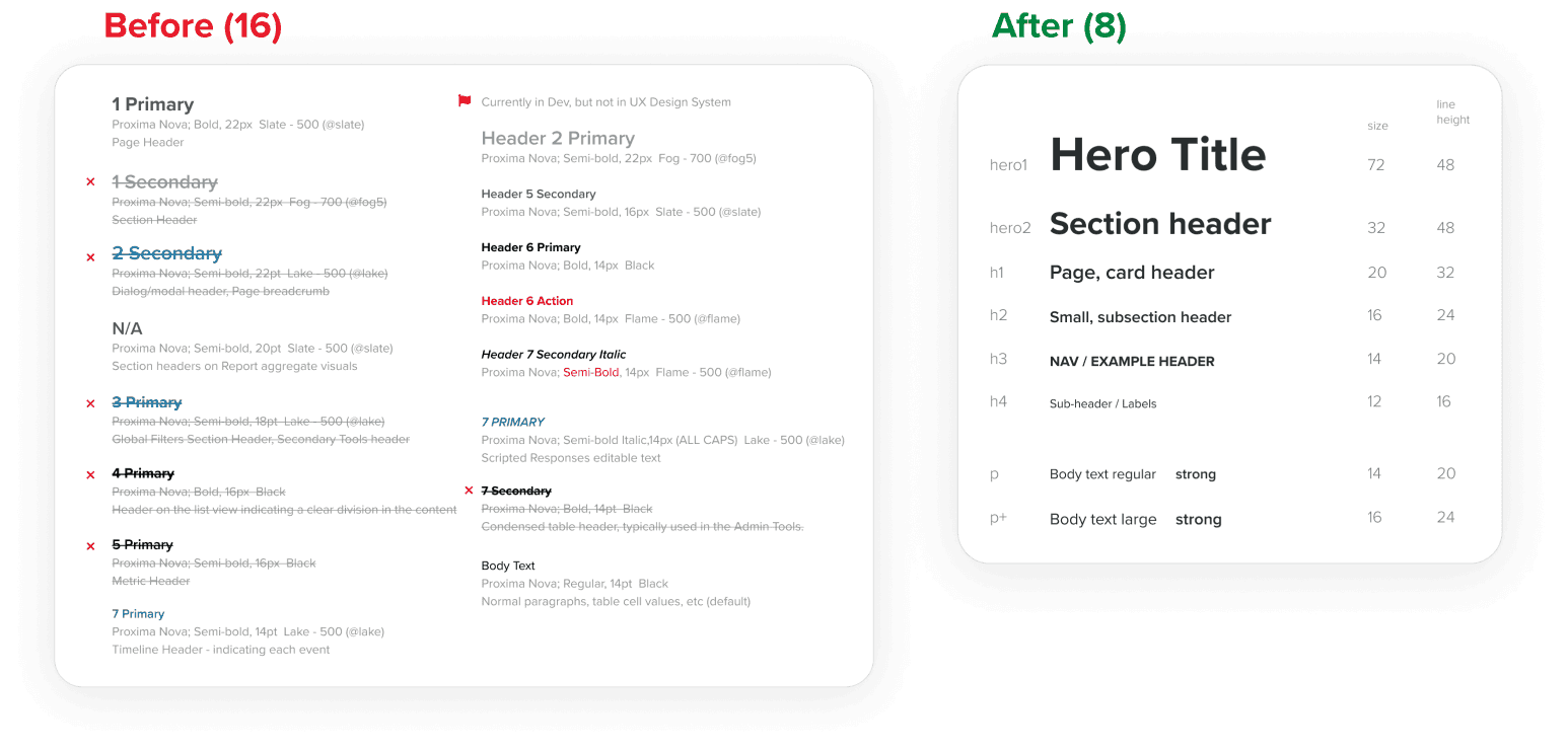
We had WAY too many type styles
The code reflected styles that were only slightly different, so I mapped old instances to a smaller generic list of tokens: each of which could have the colors I just made applied as needed per use case.
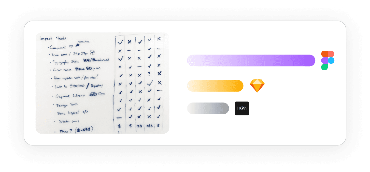
Switching from Sketch to Figma 👏
After months of creating all the core design assets I could think of in Sketch, I was ready to start using those assets in my designs. But developers couldn’t tell what was custom or a standard in our designs.
This was a huge roadblock: so I started looking into other options. After considering other options, Figma clearly won.
It took months to migrate all our work and learn a new tool, but for our devs and design system, this was well worth it.
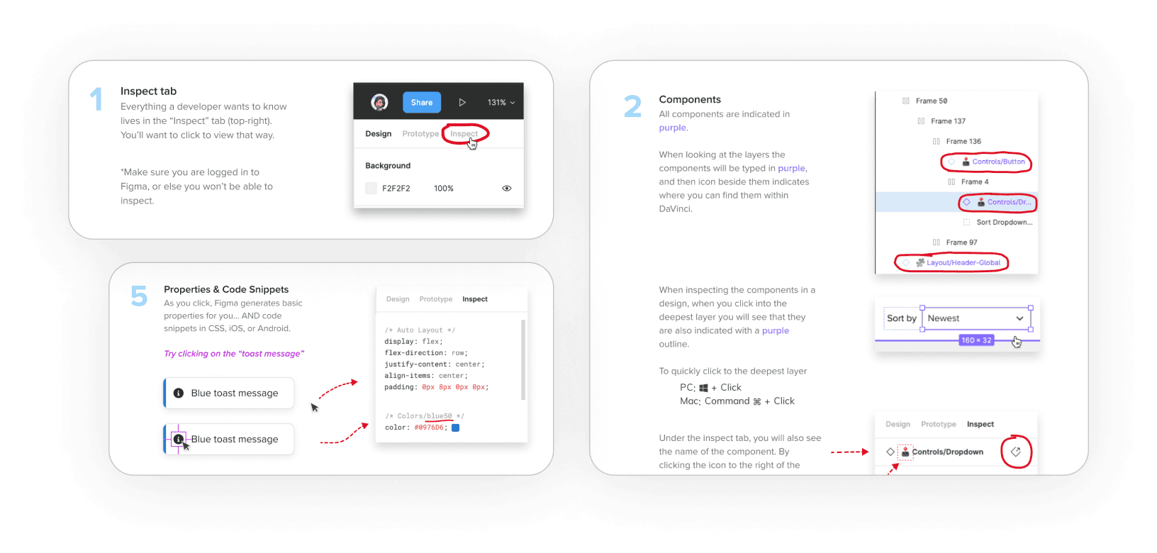
Training Developers to use Figma
Figma wasn’t just a new tool for designers, each developer would need to create a log in and learn where to find designs.
To solve that, we created “Tips for Devs” to teach them how to use the tool AND access the design system data we provided.
Ditching Confluence... Moving to Storybook
Figma wasn’t just a new tool for designers, each developer would need to create a log in and learn where to find designs.
To solve that, we created “Tips for Devs” to teach them how to use the tool AND access the design system data we provided.
Building a system – 1 component at a time
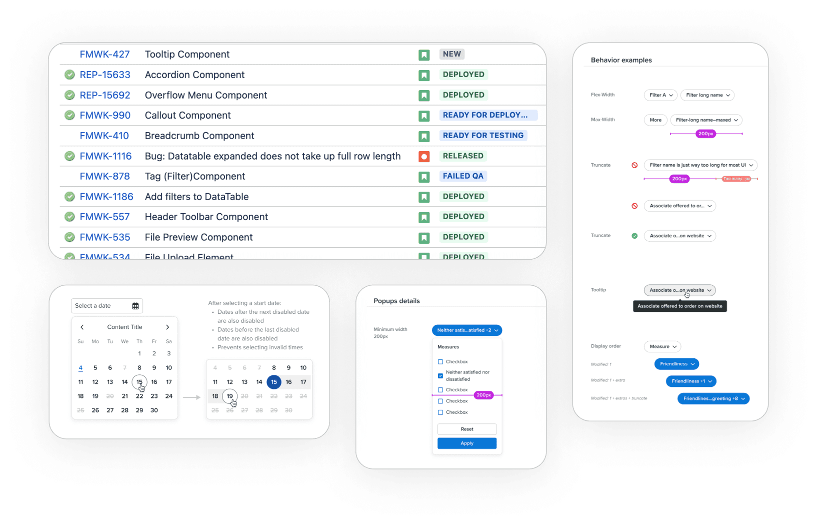
We finally convinced leadership to grant us some of 1 devs time to build our components. But since we didn’t have a whole team, we opted to start small and scale over time.
As work came up that needed a component, our UX team refined the component for all known use cases, created documentation, and pointed devs to that ticket.
This meant we only built what we needed, when we needed it: so no time was wasted and buy-in was easy.
Our goal: 1 new component per month
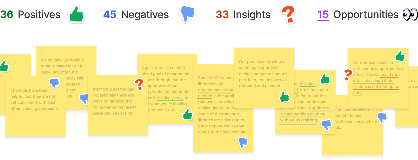
Developer surveys: before & after
Before we started this new process, we asked our devs a series of questions about how well they could find info on components, or build / re-use them.
A year and a half later, we sent that same survey out again...
• Grouped open ended notes by type
• Compared positives and negatives over time
• Found several ways to improve in the future
Impact: reduced cycle time by 38.4%
Our analysis indicated that dev cycle time dropped 38.4%!
Across 100+ employees that’s huge $$$ savings in efficiency.
We accomplished many key goals with this work. And we’ve done even more work on DaVinci since then, so that number is only higher in reality.
✅ Elevated ux and perception for clients using our tools
✅ Easier for our collaborative dev teams to find + use
✅ Faster turnarounds for new products
🔄 Improving developer documentation
🔄 Adding a change / version process
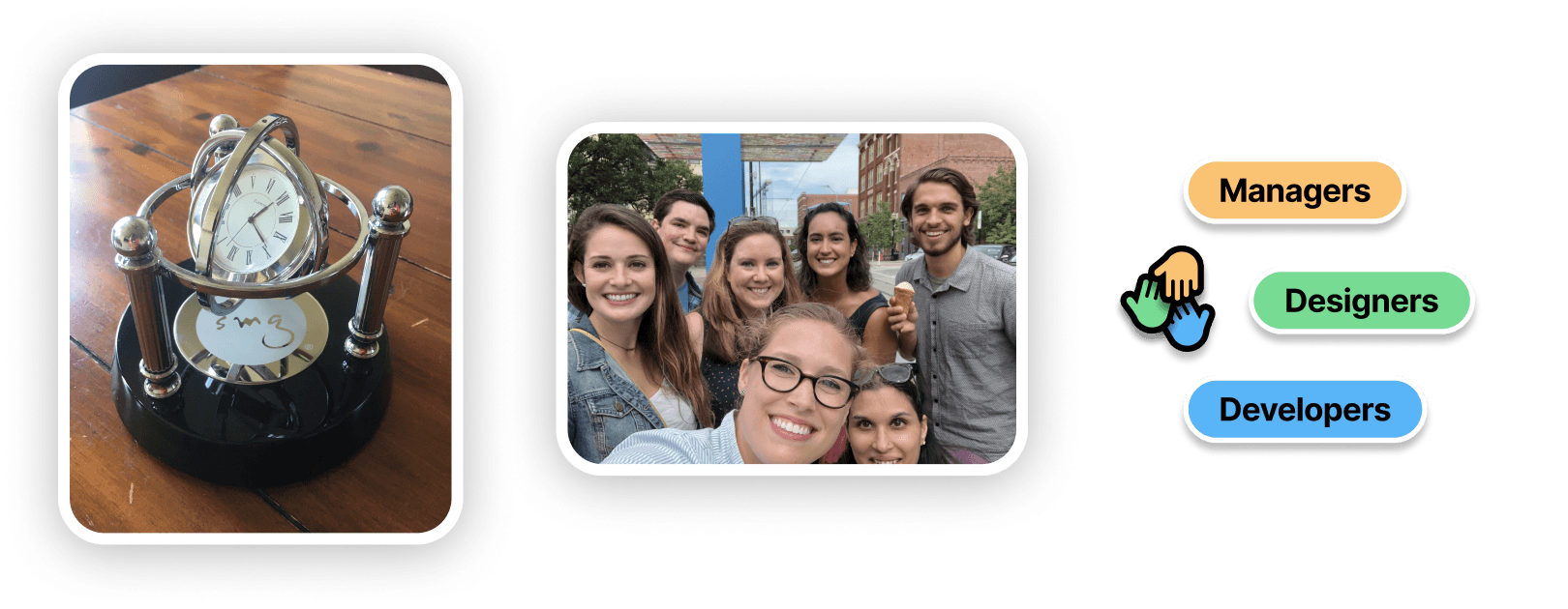
And to boot, I got an Efficiency award for helping our whole company!
...plus ice cream afterword as a team to celebrate 🍦
Davinci
Components
260
styles
91
Years
2+
Savings


